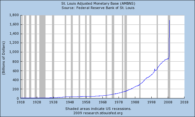
U.S. monetary base (AMBNS, all existing currency and coin). It took over 200 years to hit $800 billion, but doubled in 2007-2008 to well over $1.6 trillion. What has happened since then? Click the image to find out.
Currency in circulation (CURRCIR) shows that so far only a small amount of that new money has made it out of the banking system and into circulation. When it starts to circulate, that means more dollars will be chasing goods and services, which will bid up prices. This price increase, or price inflation, will not be evenly applied, but precious metals will likely maintain their value.
Banks borrow from the federal reserve (BORROW) and this cart shows through most of 2007. Note the spike in the late 1980's when banks borrowed $8 billion during the Savings and Loan Crisis.
Here is the same BORROW chart through 2008. The latest spike is about 100x larger, dwarfing everything in history.
Reserve bank credit (RSBKCRNS) shows the total amount the Federal Reserve can provide to the banks, plus currency (Federal Reserve Notes) in circulation.
Excess reserves (EXCRESNS) shows reserves in excess of the amount that the Federal Reserve requires the banks to maintain. Excess reserves are ready and waiting for the banks to create even more money based upon those reserves. Again see the little blip in the 1980's, but nothing like today.
When supply grossly exceeds demand... What do you think is going to happen to the dollar?
All charts are using FRED Graph from the website of the Federal Reserve Bank of St. Louis.